Lloyd's
Ownable, accessible and unmistakably Lloyd’s.
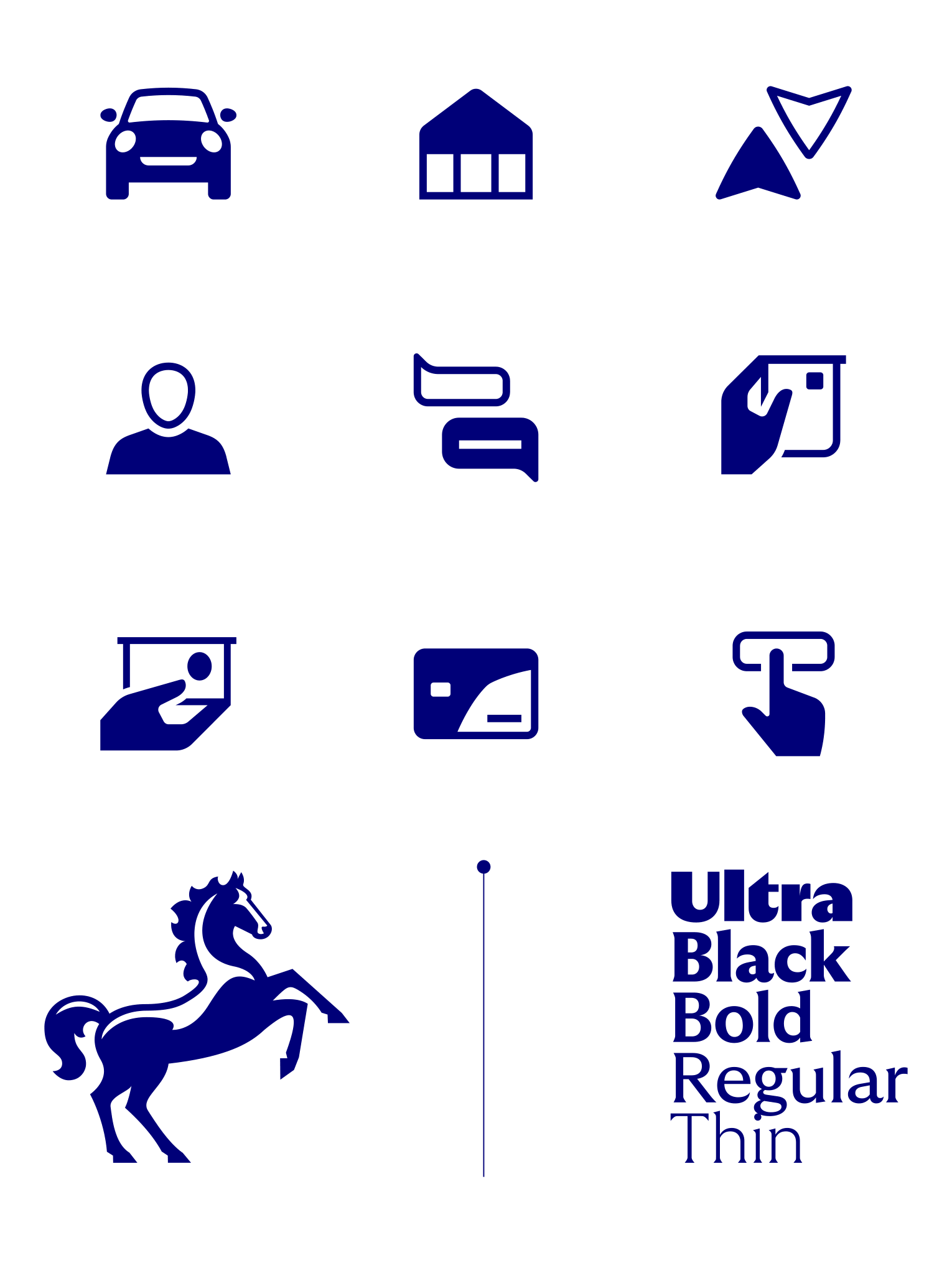
Following a major overhaul of the brand by Wolff Olins, Lloyd’s tasked me with creating a bespoke iconography language that sat elegantly between their reworked Cancara horse and custom type.
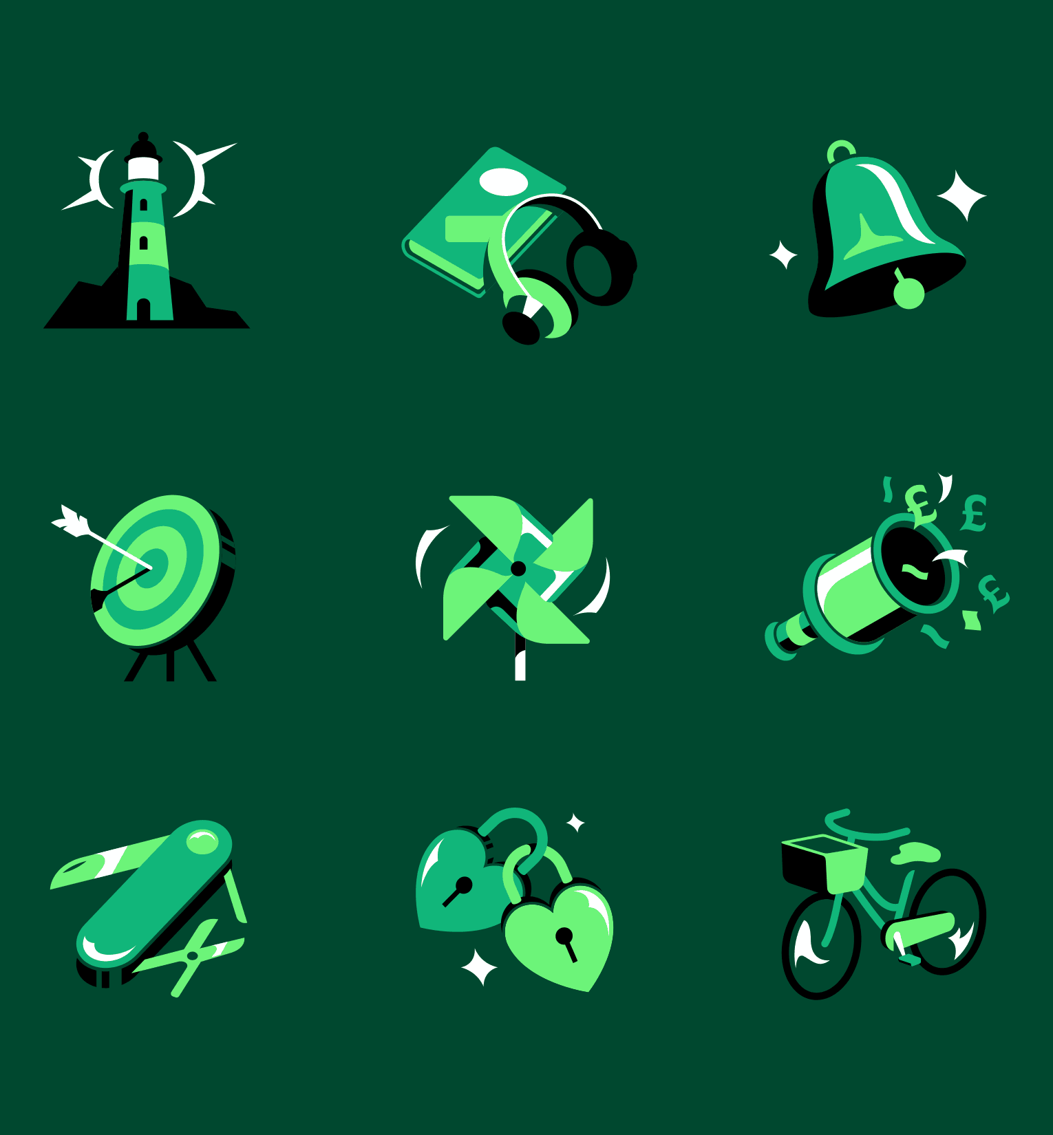
A second part of the brief was to build on six spot illustration concepts, created for use as decorative details across their pages, and develop them into an entire library of illustrative designs.
Building on Lloyd’s proud heritage as an established yet innovative British bank, I leant into metaphors that celebrated a distinctly British wit. Sand castles, seagulls and 99s. Stylistically, the UI icons adopted the logo’s balance of positive and negative space.
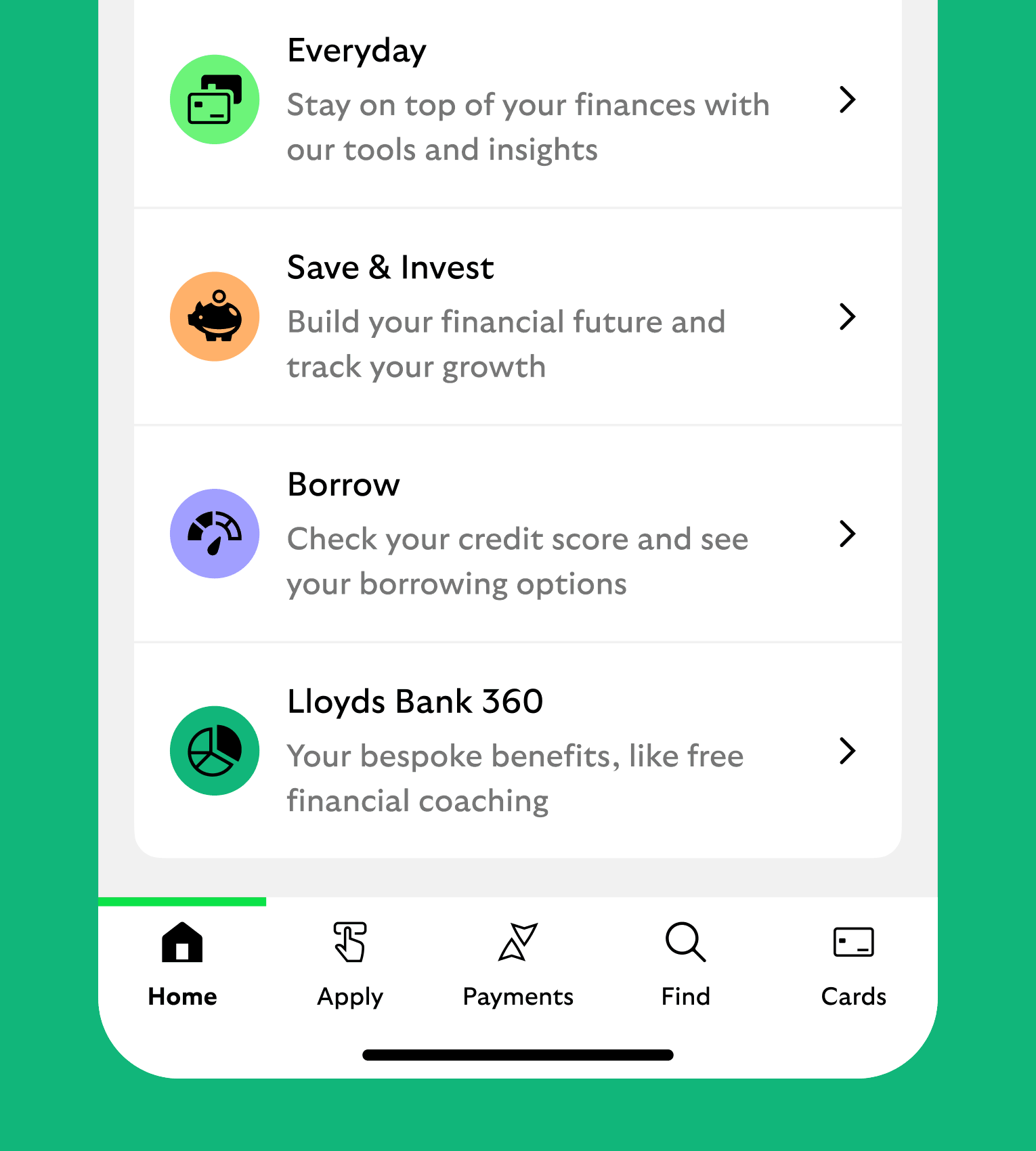
The result was an ownable and characterful semi-solid set that injected moments of functional charm across the various user interfaces.
The spot illustrations dialled the charm up to eleven, providing customers with informative signposts, helpful moments of reassurance and the occasional wry smile.
Most importantly, the icons and illustrations performed. Not only have they gone on to serve and delight millions of Lloyd’s customers around the UK, they tested strongly with low-vision users through the Digital Accessibility Centre and became part of Wolff Olins’ award-winning work.