Electrolux
More human, intuitive and consistent.
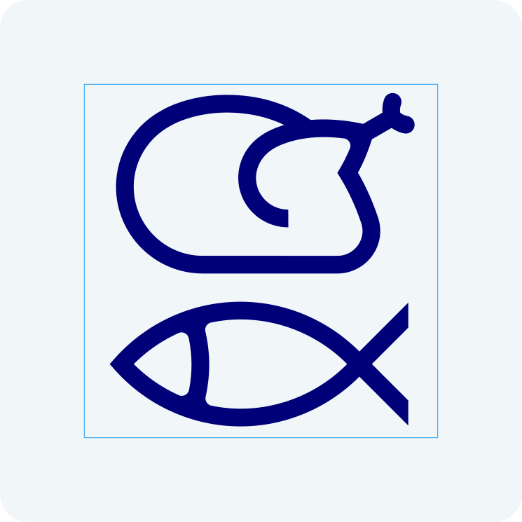
Electrolux icons are some of the brand’s hardest-working assets. They shape the first interactions between consumers and their appliances, interfaces and services. Often at tiny sizes, and in the moments where clarity matters most.
The brief was to bring coherence, clarity and warmth to a global pictographic language used across three major brands: Electrolux, AEG and Frigidaire.
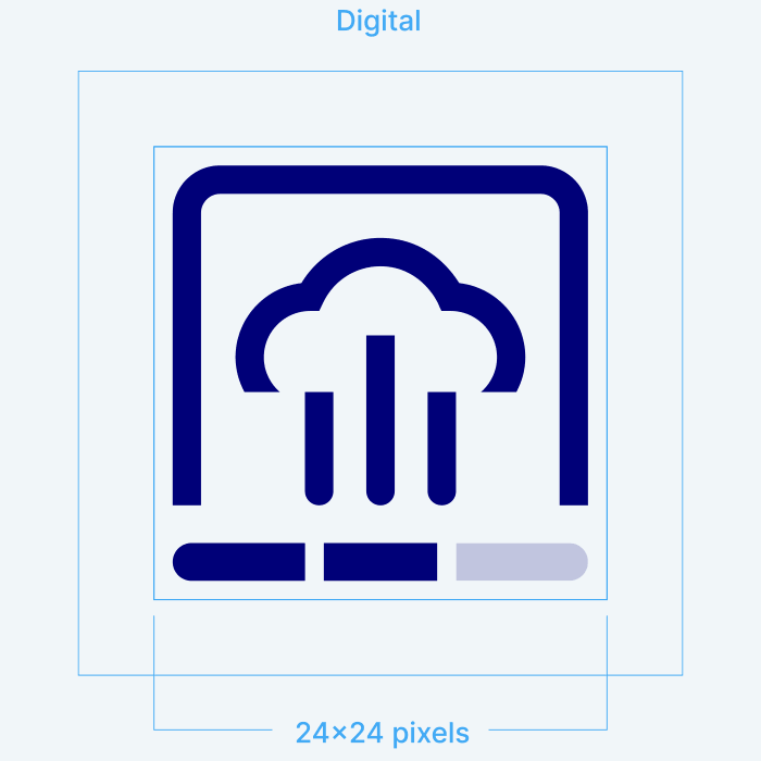
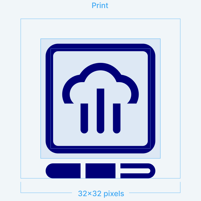
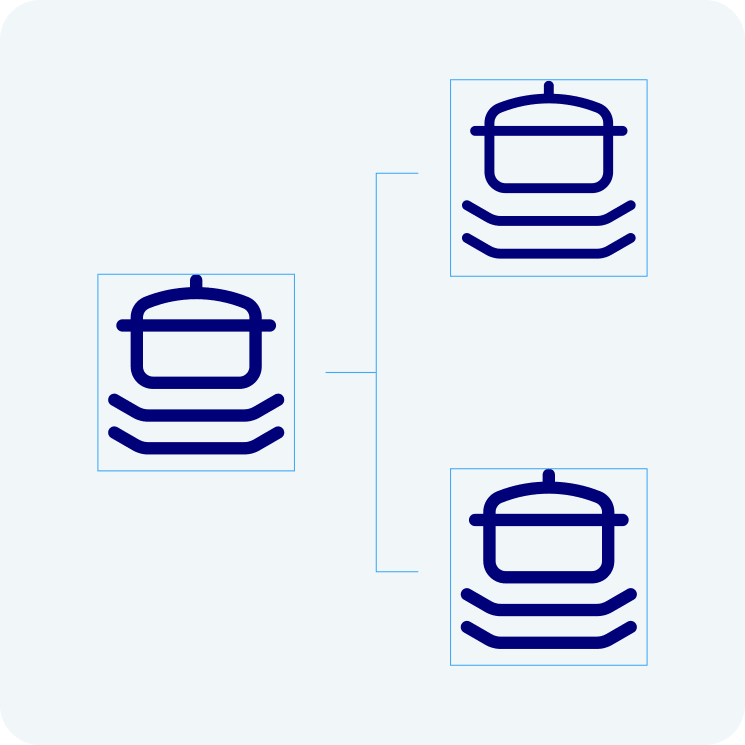
The system began with structure. A single pixel grid for digital and print. Standardised stroke weights and proportions. Clear rules for selecting, scaling and combining metaphors.
Most importantly, the icons were designed to feel like extensions of the products themselves. Considered, intuitive and reassuringly human. Symbols built with the same care and attention as the appliances they live on.
The result is a unified global library of icons for appliance UI, web, mobile and print. A more human language for millions of everyday interactions, across brands, across products and around the world.