Approach
Signs.
You're out
of touch.


The same is true of many of the pictograms we use.


Whereas they could be helping to
make the World a better place.
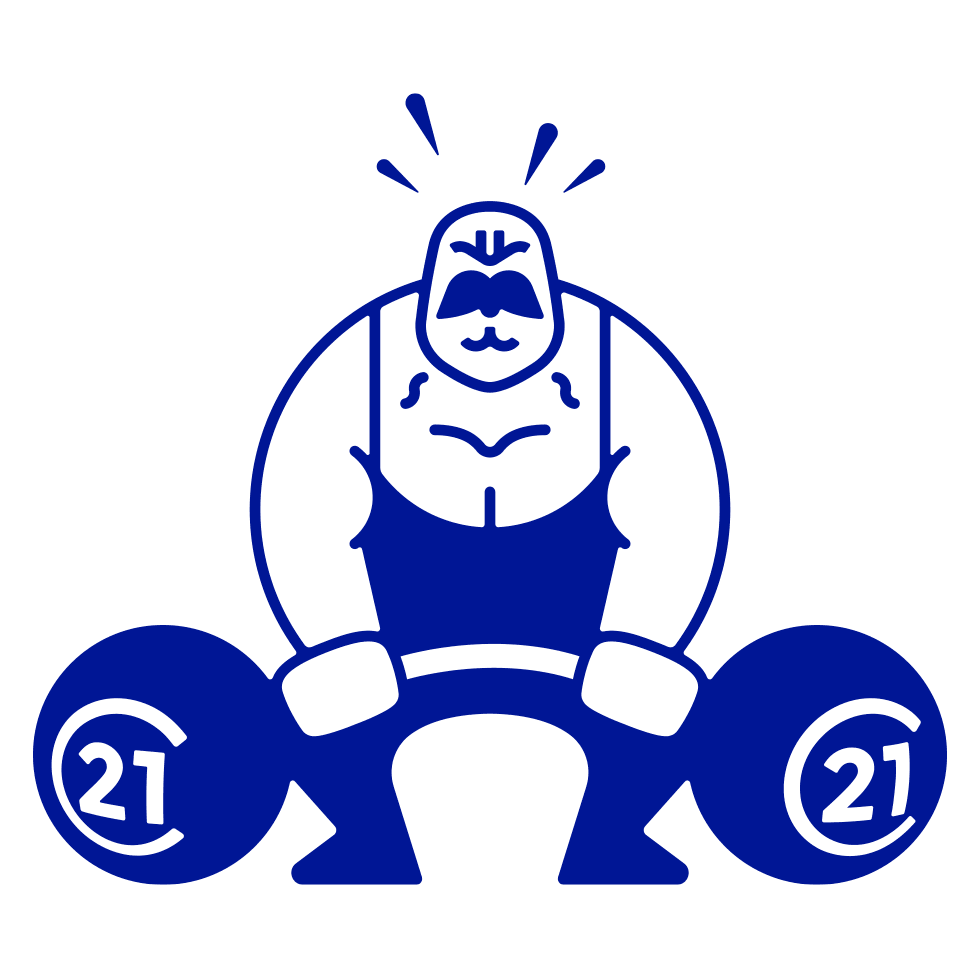
By challenging toxic
behaviours and beliefs
behaviours and beliefs
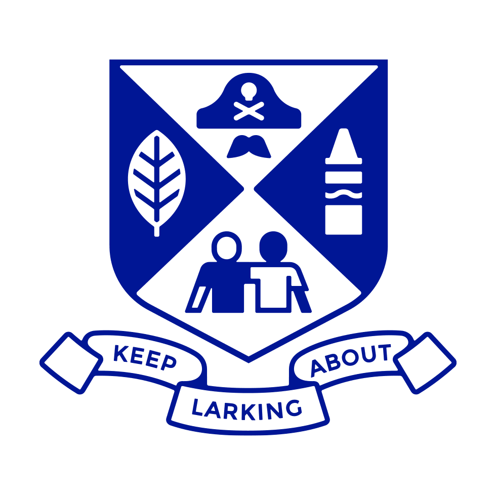
Or teaching our kids the
importance of creative play
importance of creative play
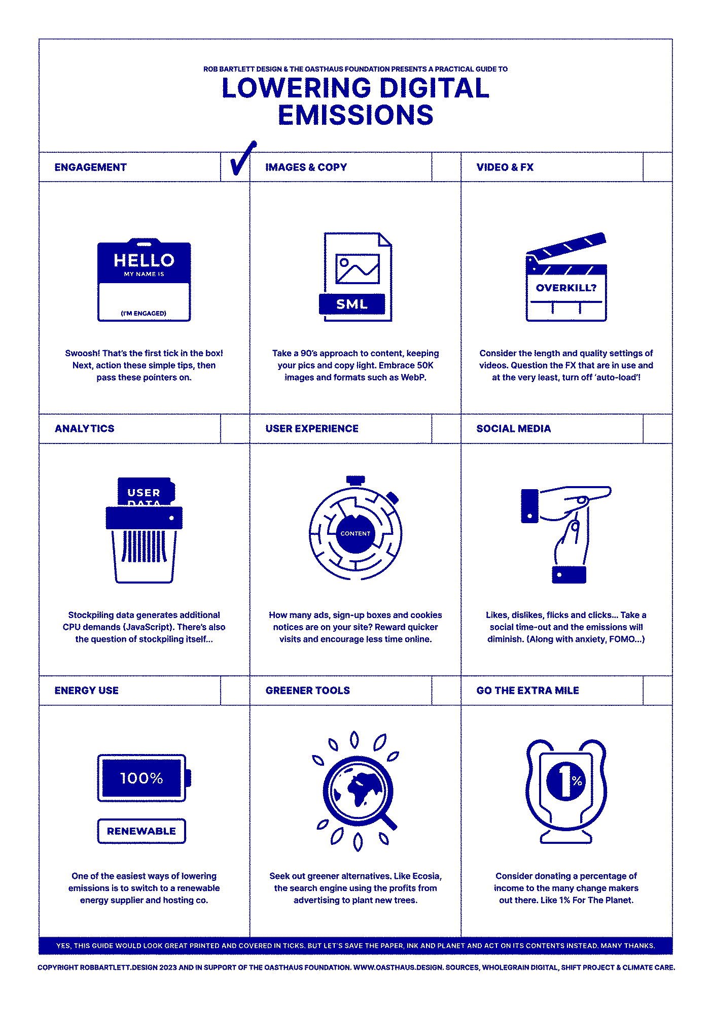
They could be helping us with
environmental issues.

By dissuading us from
needlessly pressing Print.
needlessly pressing Print.

By counting the CO2
our files produce.
our files produce.
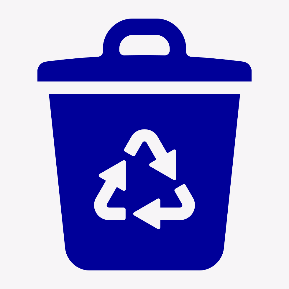
By reminding us to
recycle rather than landfill.
recycle rather than landfill.
And encouraging each of us to make
small but necessary changes.
small but necessary changes.
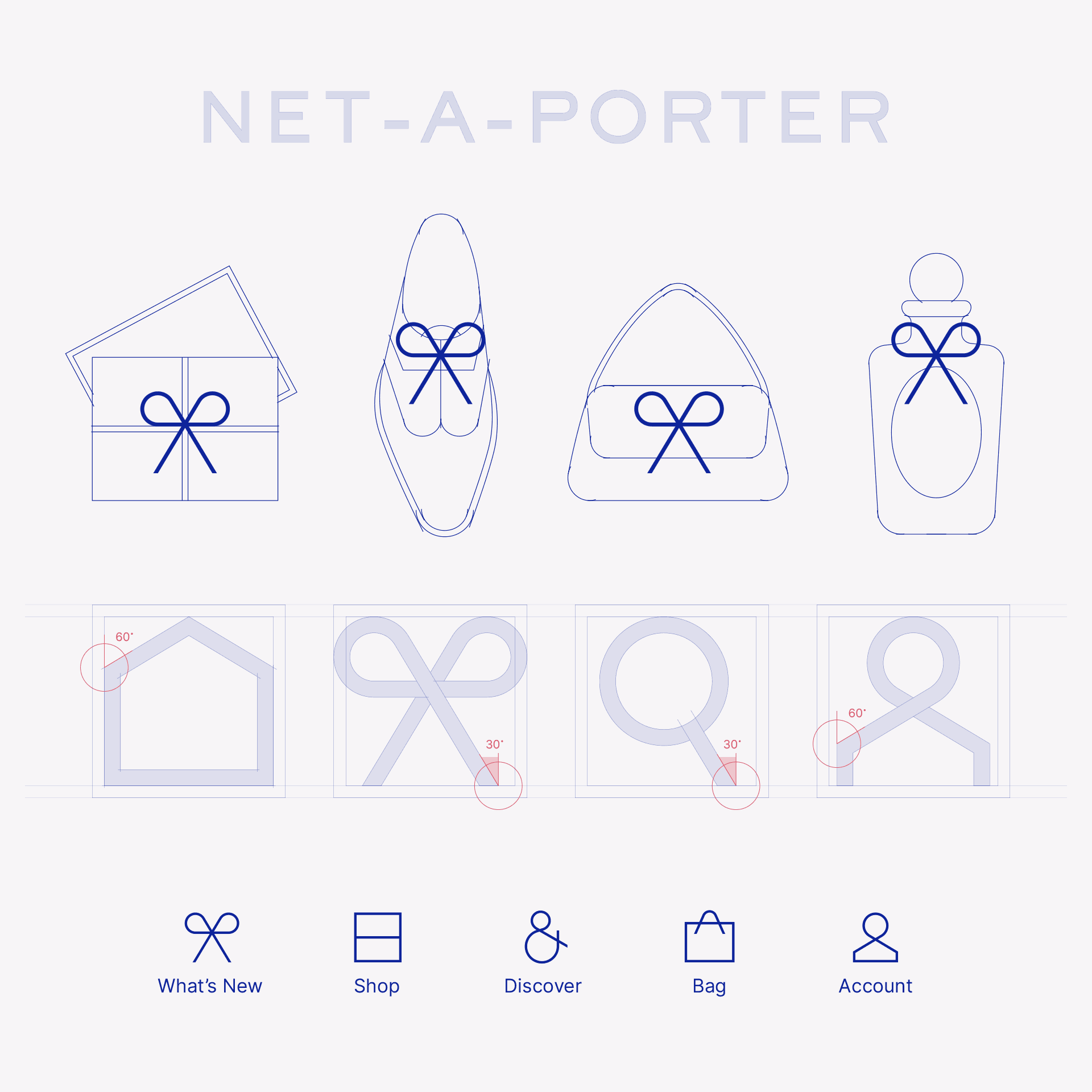
They could be helping to humanise
our digital lives.

'Book A Service'

'4WD Transmission'
And bringing a sense of quiet reassurance to
every tap, press and slide.
They could be making our products
more obvious and pleasurable to use.

And as a brand, demonstrating just
how much you care.
This is what I do.
Fancy a chat?